deng-logo-vr2-t

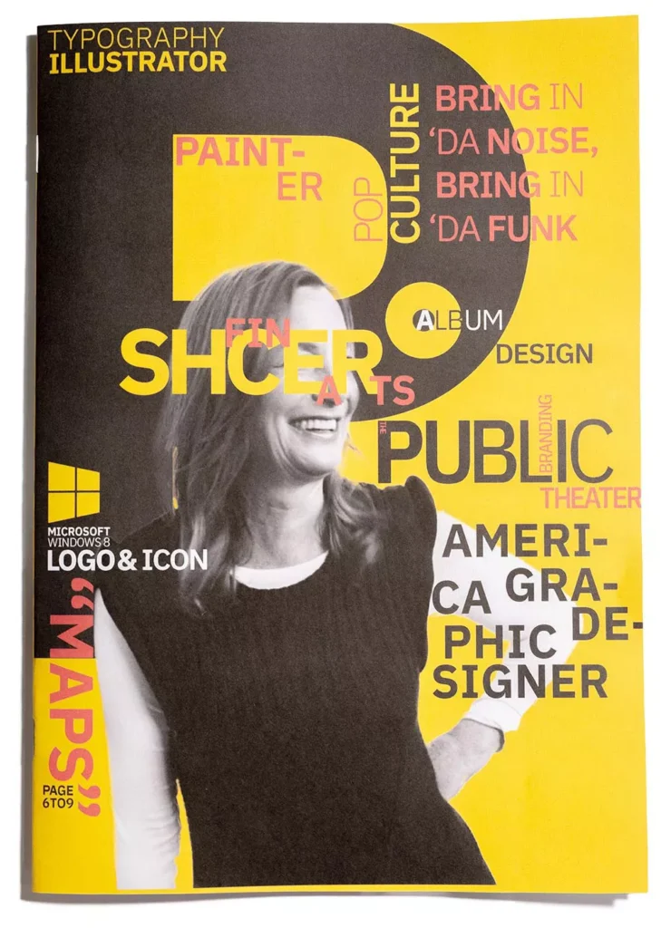
"My work is play. And I play when I design."

Paula Scher

There was a typo in the cover design. I had misspelt her name. But, in my defence, I am an ESL, and InDesign can't pick up name spelling. It was a silly mistake on my part, should've gone through by a native speaker for print proofs.
封面设计有错别字。 我拼错了她的名字。 虽然英语并非本人母语,InDesign也没法识别名字错拼间接导致了这个结果。 但是无法避免这是一个愚蠢的错误,我应该在印刷前寻求母语人士帮忙校对。

Description / 项目简介

Paula Scher is a highly acclaimed graphic designer, renowned for her iconic typography and vibrant, dynamic style. Her passion for design and artistry is reflected in her impressive body of work, which spans several decades and includes everything from album covers to branding for major corporations.

Throughout her career, Scher has demonstrated a keen eye for colour and composition, often utilizing bold, expressive lettering to convey a message or evoke a mood. Her designs are known for their playful energy and distinctive personality, making her a favourite among clients and audiences alike.

In this publication, I aim to showcase Scher's creative genius and highlight some of her most memorable projects. To demonstrate my appreciation for Scher's impact on the world of design. The initial research has allowed me to learn about the work she has done. Thus, inspired the visual of this publication.

Paula Scher 是一位备受赞誉的平面设计师,以其标志性的排版和充满活力、充满活力的风格而闻名。 她对设计和艺术的热情反映在她令人印象深刻的作品中,这些作品跨越了几十年,包括从专辑封面到大公司品牌的一切。

在她的整个职业生涯中,Scher 展示了对色彩和构图的敏锐眼光,经常使用大胆、富有表现力的字体来传达信息或唤起一种情绪。 她的设计以俏皮活力和鲜明个性着称,深受客户和观众的喜爱。

在本出版物中,我旨在展示 Scher 的创造性天才并重点介绍她最令人难忘的一些项目。 表达我对 Scher 对设计界的影响的欣赏。 最初的研究让我了解了她所做的工作。 因此,激发了本出版物的视觉效果。

项目
设计师杂志
AUT传媒设计工作室
大二第二学期

交付成果
A4 杂志
A3 打印项目工作簿
在线工作簿

项目带头人

David Coventon
George Hajian

链接

在线工作簿

The design ideology was to bring familiarity to the viewer. Scher loves to play with typography and enjoys painting. The initial research has allowed me to learn about the works she has done. Thus, inspired the visual of this publication.

设计理念是为观众带来熟悉感,并让人一眼看出设计师的风格。 Scher 鲜艳的色彩应用,绘画和突破常规的排版运用奠基的本刊物的基调。 我最初的研究也让我我得以解了她所做的工作。 因此,激发了本出版物的视觉效果。

The cover page content the works, type of work, info, and her clients. With the letter “P” as background and around to the back cover to from her name.

封面内容包括作品、作品类型、信息和她的客户。 以字母“P”为背景,围绕着封底以她的名字命名。

Walk along the path / 循迹

When the research goes more in-depth, I realised the motive of her drawing, and exclusively on maps is probably affected by her childhood memory. Her father, who is a photogrammetric engineer, and works closely with map-related aerial photography metering. Therefore, the series of map-making, drawing was extraordinary for me. The time that she took to research and paint word by word was to show a serious designer. thus I decided to try it out myself and the example will be the map page with the words “walk along the path.”

研究深入后,我才明白她画画的动机,只画地图,大概是受到童年记忆的影响吧。 她的父亲是一名摄影测量工程师,与地图相关的航空摄影测光密切合作。 因此,这一系列的地图制作、绘画对我来说是非同寻常的。 她花时间逐字研究和绘画是为了展示一位认真的设计师。 因此我决定自己尝试一下,示例将是带有“沿着路径行走”字样的地图页面。

The Map (Timeline) Page was made with digital drawing via an iPad, in order or rather to try to experience and understand the process behind her maps. It is easily one of the most time-consuming parts of all, especially drawing letters. drawing the letters with consistent style, size, and shape was a big challenge for me, and the overall result is satisfactory.

The paper stock in this publication was an accident, I was looking at some drawing paper, and I found a sketch pad that has a slightly blue tone white paper with GSM around 80-120 (did not labelled). I bought one and made a test print. The result was better than plain white, or snow white. Furthermore, the texture of the stock was grainier than the usual paper. Therefore, it is nicer to touch and not stick to the finger-like the glossy paper. The higher GSM also creates a premium feel. Thus, the publication was printed with that stock.

Another highlight of the publication, such as the cover page for each section (content page, intro page, article page) all had their unique design. With the coloured page number as the background so that the page itself won’t be too pale, and sometimes creates a nice bonus as a visual guide.

出版物的另一个亮点是每个节点封面(内容页、介绍页、文章页)都有独特的设计。 以彩色页码作为背景,使页面本身不会太苍白,同时也作为视觉指引从而产生不错的视觉流。

Design detail / 设计细节

奥克兰理工大学作品

本作品是隶属于我在AUT学习期间制作,使用及传播需要遵循许可协议。详细可查帮助中心。
This post is an AUT university project, the use of any kinds must obey the terms.

版权保护

作品含有版权保护内容

不可下载

未经授权,不可下载

不可商用

含有版权保护内容,严禁商用