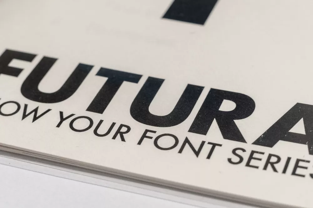
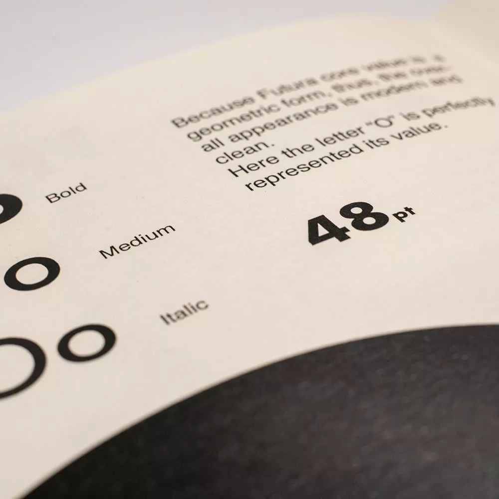
FUTURA
20世纪被使用频率最高的字体之一。即使是在今天,该字体仍然适合用于各类科幻设定场景使其成为最通用化和最具代表性的字体之一。
Futura was one of the most used fonts in the 20th century. Viewing it today, it is still a fantastic typeface that more than adequate to be the representation of timeless font.
项目简介
对排版设计和排版元素的应用有基本的了解。 能够识别所选字体的关键概念,并了解其对社会和排版行业的历史影响和影响。
To get a basic understanding of layout design and application of typography elements. Be able to identify a key concept of the chosen font and develop an understanding of its historical impact and effect upon the society and typography industry.
项目
字体鉴刊物
AUT传媒设计工作室
大二第一学期 项目2
交付成果
A5 骑马钉封装刊物
A3 项目工作簿
在线工作簿
项目带头人
David Coventon
George Hajian
链接
在线工作簿
Project Aim
To get a basic understanding of layout design and application of typography elements. Be able to identify a key concept of the chosen font and develop an understanding of its historical impact and effect upon the society and typography industry.
Font choice
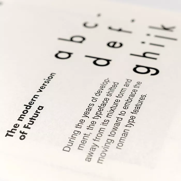
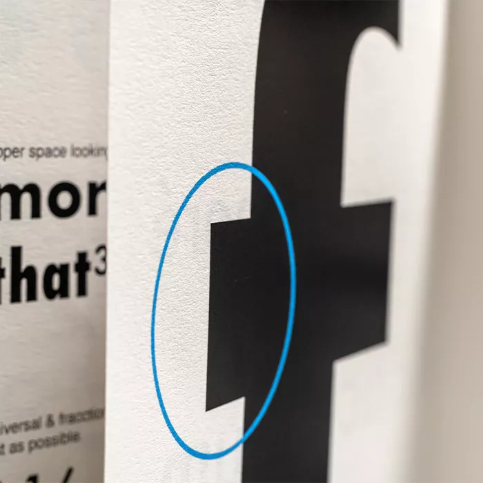
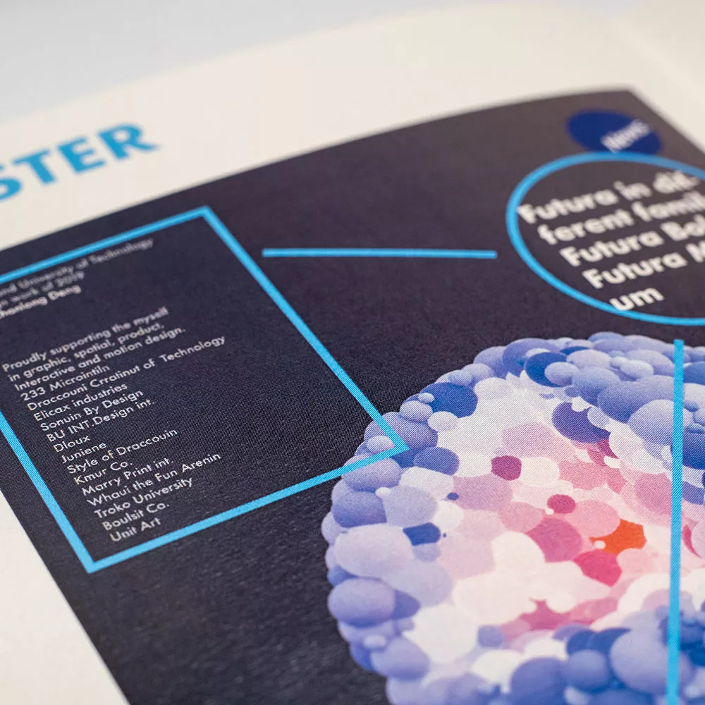
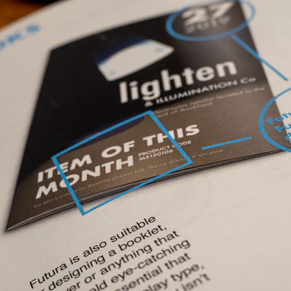
In this project, I have chosen Futura as my main focus. Because of its rich historical usage and popularity. The format of this booklet is A5 sized. I was thinking of using as minimal as possible design ideology, let the viewer focus on the type itself. However, the booklet font was not used Futura exclusively. Body text, for example, I decided to use Helvetica as the primary typeface. The reason for that is due to Futura’s limitation. In a smaller publication like this, type needs to be easy to read, which means the readability is the key factor whether or not the viewing experience goes smooth and troubleless.
History
The reason I prefer Helvetica over other sans-serif fonts is because of its historical relation with Futura. They were both born in the 20th century, where during the modernism period, they are popularised by other designers due to their simplistic design, and futuristic expressions. And more importantly, Helvetica is accessible for the majority of the population, thus making it and Futura one of the most used fonts.
Research
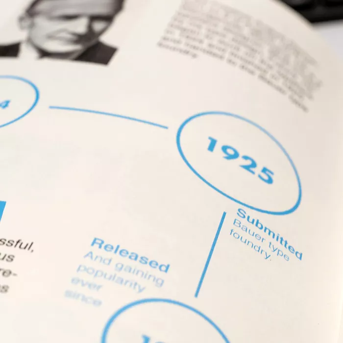
When I started the initial research regarding the font, I soon find myself buried in the vast amount of available information. When choosing the content, I came across a wonderful piece of an article called “Paul Renner and Futura: The Effects of Culture, Technology, and Social Continuity on the Design of Type for Printing” By Charles C. Leonard in Georgia State University. I discover some of the fascinating histories of Futura and its influence. Some amount of my contents and background histories were coming from this paper.
奥克兰理工大学作品
本作品是隶属于我在AUT学习期间制作,使用及传播需要遵循许可协议。详细可查帮助中心。 This post is an AUT university project, the use of any kinds must obey the terms.
版权保护
作品含有版权保护内容
不可下载
未经授权,不可下载
不可商用
含有版权保护内容,严禁商用