POP FOR SHENZHEN BRIGHT FOR BRONIES
色彩也有身份,像这座城市与她的人民。
Colour has identity, like the city and the people.
Big idea, subtle detail.
When designing the outline for SZBA, I was thinking of using straightforward typography to form the logo. But I soon realise this might not work, it’s too formal, and when I speak to the client, they also said the logo should be a reflection of the group, as young creative individuals. That is when geometric shape comes to play, these shape looks simple, yet have the capacity to shaping endless form. Building with shape is much more like a play; overlap and merge, like the bronies, keep merging and grow.
An open-minded group.
This is the first time I’ve encountered such fascinating subculture. Working with the bronies so they called, is rather refreshing. The ideology is quite different among other subcultures. My client, in this case, is mostly young people by talking to them about their identity and idea so that I could understand from their perspective. And at this point, I already had some basic idea of what I might do.
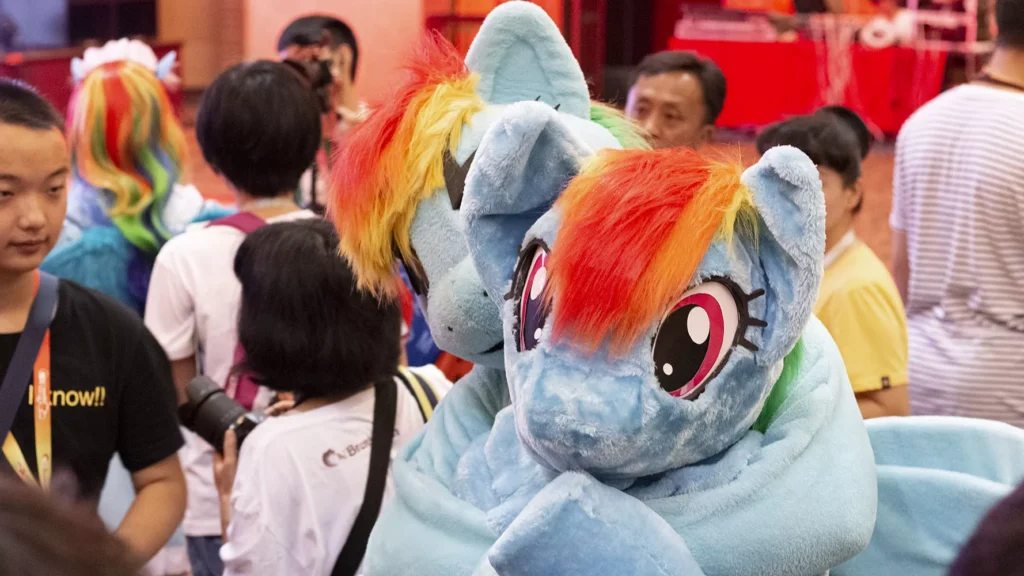
Photography © Zhanlong Deng