Typographic Design Authorship : Feature & Layout Design
This project aim is to use the provided article to create a layout design.
关于文章
About the article
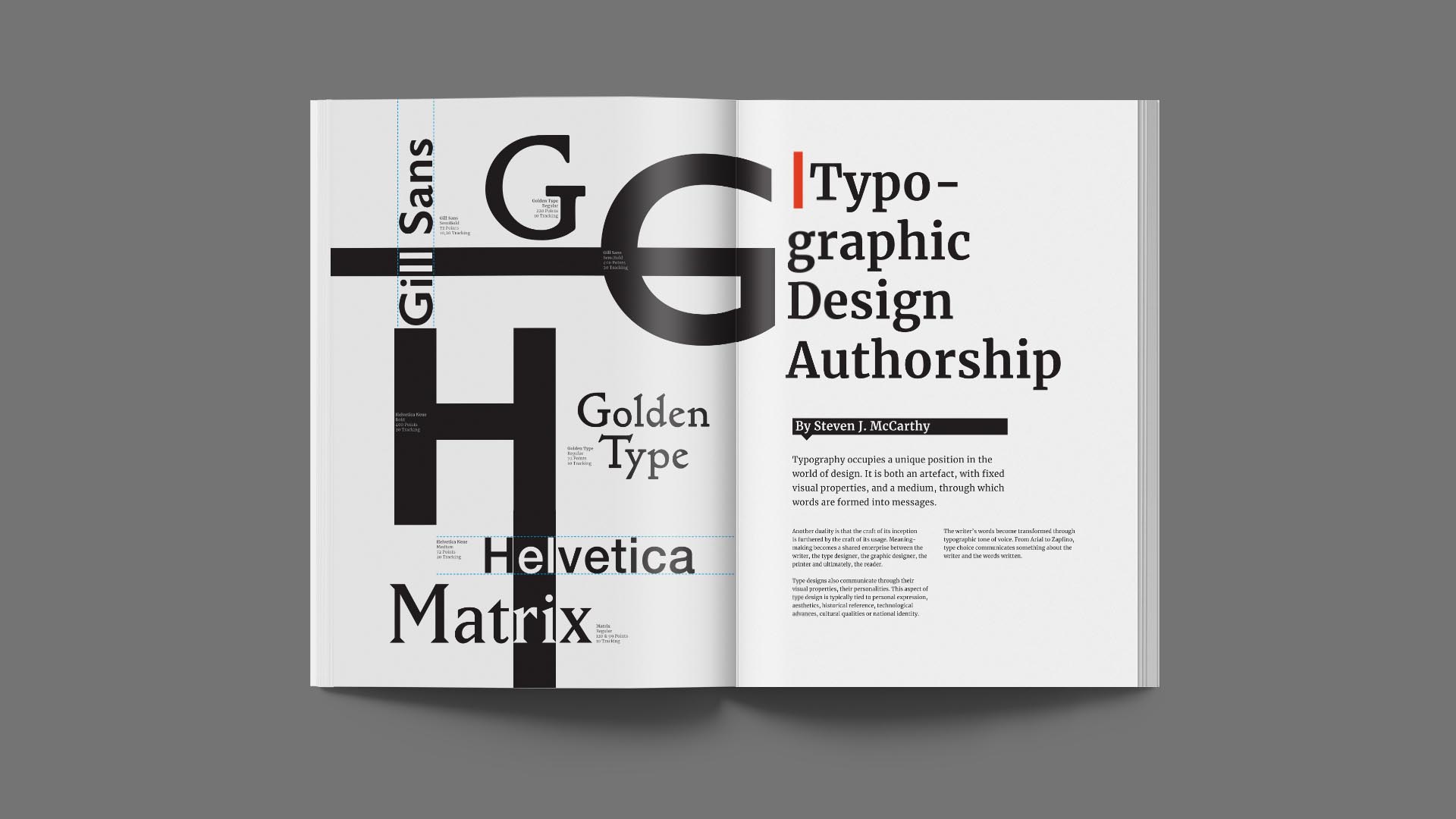
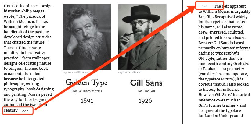
The article mainly discusses type design through time, how the typeface was used, and seeing type differently. And how the typographical evolution. In the study, the writer listed several fonts to tell the story, and I think it could be more visually comprehensible to make a design out of those fonts.
Markers
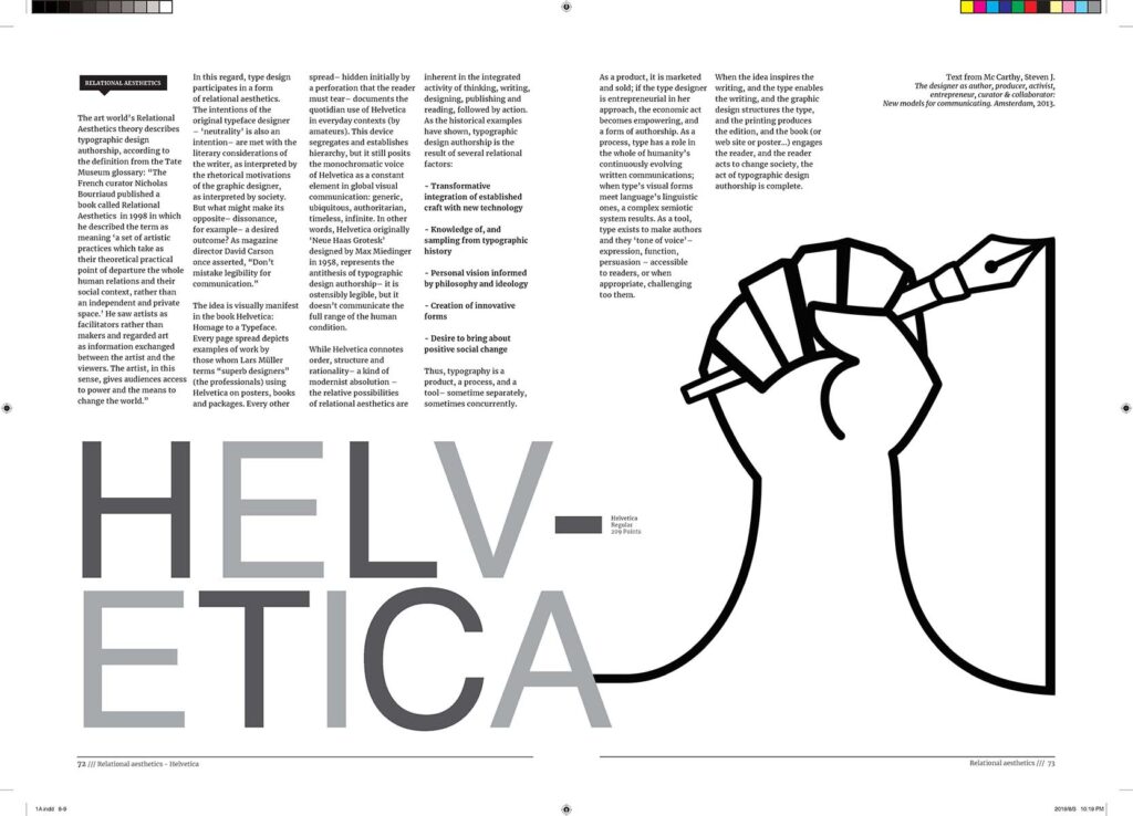
About the marker on the top of the page is an indicator, to tell the viewer where to start, and a section title up close. The colour and spacing around it are planned; the contrast is high enough to grab the attention and would not cause severe distraction.
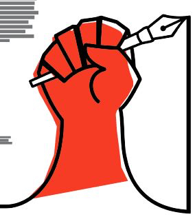
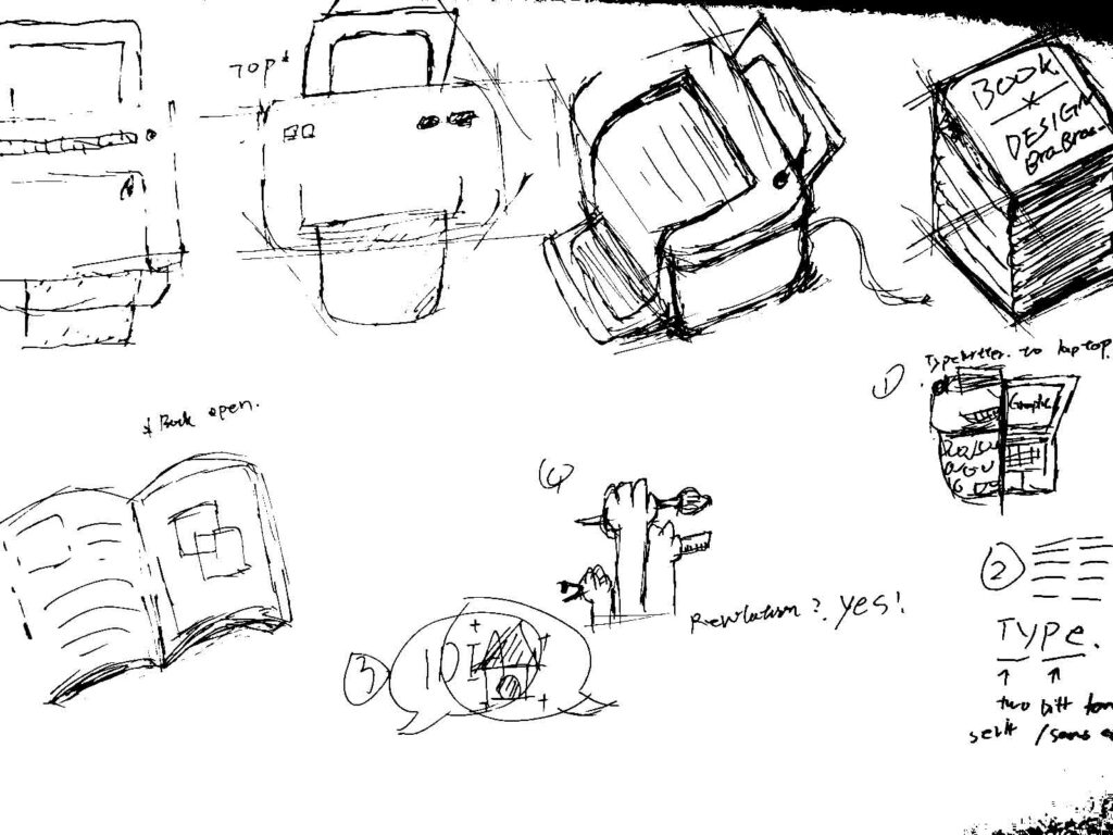
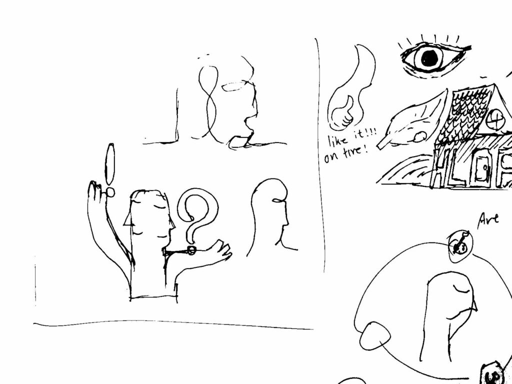
Illustration
The only illustration used in this project was on the last page a raised hand holding a pen. The idea of that drawing is to repose the last paragraph regarding the five factors. There are several versions of the drawing.
Why not indent?
The reason I choose to leave a line of space between every paragraph to indicate an end or start of a section rather than using indent or drop cap is that I am using left alignment for the body text; therefore if I were using indent, it would most certainly create an even worst alignment which results in poor reading experience. With that said, I did use indent in one scenario, whenever there was a massive gap between the text box, I would use indent and a little marker to tell the viewer where to continue reading.
Why not justified?
The reason I did not use justify is due to word spacing. Though it creates a perfect alignment, it cloud also creates some messy rivers. Several methods have been applied to try to solve this issue such as changing the font size, adjusting the tracking and kerning, and turning on and off hyphenation. However, the result is even worse spacing and alignment. The possible explanation is the available column space is a bit narrow. Therefore, the final decision is to give up justified and set all body copies to left alignment.
Future opportunities
I recently learned a new function within InDesign that could modify the justification settings so that it could produce fewer rivers. However, I discovered it after the fact; therefore, this is the part where I am not satisfied with my work and could be improved for the following project. If the same issue is encountered in the future design, I would know how to solve it, because one of the advantages of using justified text is it is more uniform and clean, thereby producing a design that looks more polished and professional.
References
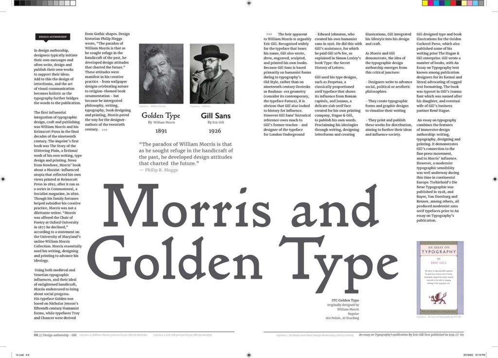
Image of William Morris portrait :
Payton, M. (2016, March 24). Who was William Morris, the artist, textile designer and social reformer? Retrieved from https://www.independent.co.uk/news/people/william-morris-5-things-you-didnt-know-about-the-artist-and-textile-desi gner-google-doodle-a6949471.html
Image of Eric Gill portrait :
Cooke, R. (2017, April 09). Eric Gill: Can we separate the artist from the abuser? Retrieved from https://www.theguardian.com/artanddesign/2017/apr/09/eric-gill-the-body-ditchling-exhibition-rachel-cooke
Image of the Book cover of An essay on Typography’s publication :
Gill, E., & Skelton, C. (1988). An Essay on Typography: D.R. Godine. Retrieved from https://books.google.co.nz/books?id=44Yq6UplAbAC
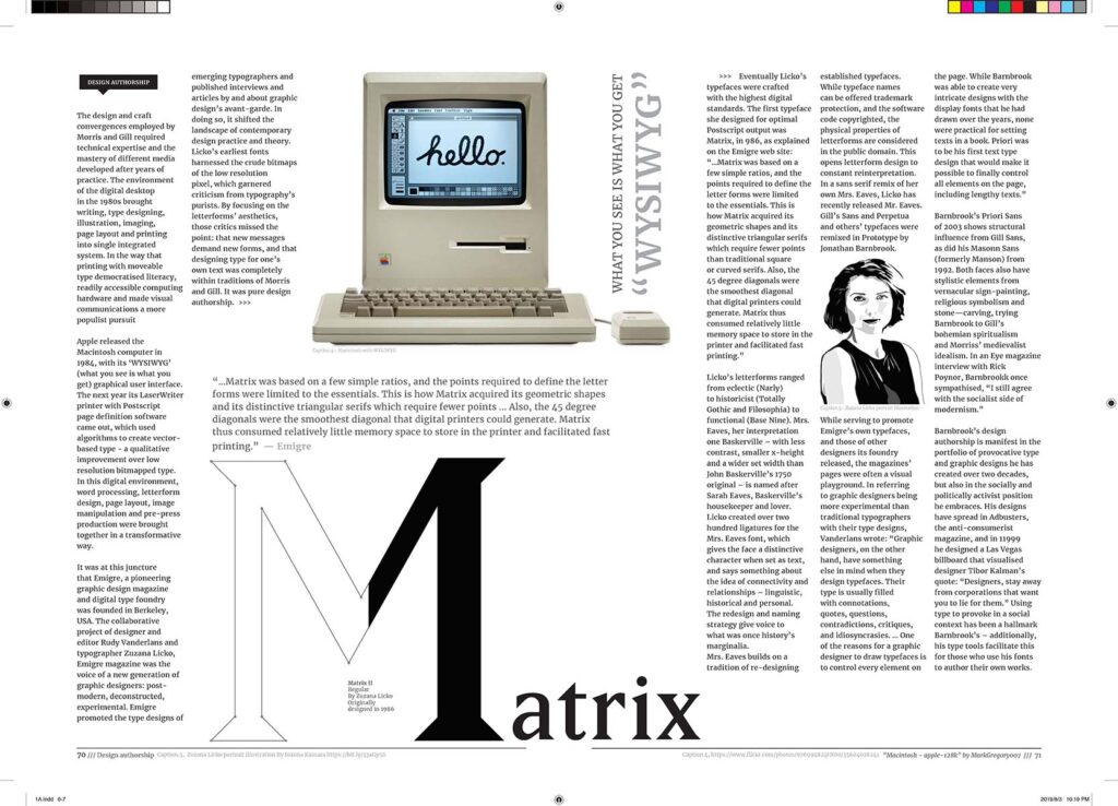
Image of Macintosh apple 128k :
Mathosian, M. (2017, July 05). Macintosh – apple-128k. Retrieved from https://www.flickr.com/photos/97699482@N00/35604028241
Image of Zuzana Licko portrait illustration :
Kassara, I. (2013, July 21). Zuzana Licko Typography. Retrieved from http://www.studentshow.com/gallery/9944645/Zuzana-Licko-Typography
本作品是隶属于我在AUT学习期间制作,使用及传播需要遵循许可协议。详细可查帮助中心。
This post is an AUT university project, the use of any kinds must obey the terms.