Dave Stop 过程与想法
戴夫停下系列海报以《2001太空漫游》这一经典科幻电影为载体,尝试使用排版和元素来设计3份有关连,循序渐进的印刷海报。海报中的文字均来自于三部电影/电视系列台词独白。(独白的 YouTube 链接在单独的文档中提供*)
Aims Design and layout three typographic posters, using the script from three movie/TV monologues (YouTube links to the monologues are supplied in a separate doc*).
2001太空漫游系列海报 / Poster series – 2001: A Space Odyssey
The series of works tried to portray the idea of fear of disappearing and losing self-awareness, identity, and memories. As the film demonstrates, HAI9000 was set up to be a machine with humanoid characteristics, such as being capable of displaying emotions and intelligence in certain situations.
- The treatment of the posters was focused on HAI’s fear, by using high-contrast colours and negative space, to recreate the anxiety that HAI experiencing at that moment.
- The posters were trying to propose a question, about what it would be like to lose all memories, a pitch-black, darkness.

我的观察 / Insight
关于影片 / About the film
In the short, Dave is shutting down HAI due to its somewhat unforgettable mistake. As he gets into the HAI’s memory container. HAI was trying to persuade him to stop, by showing its regret for the mistakes, being passionate about the mission, and promising Dave that things would go back to normal. During the following times, HAI repeatedly emphasised the same info, with a faster tone, and anxious emotion. When Dave pulling out HAI’s memory modules, HAI transformed into another stage, although the messages were mostly identical, the tone or rather the sound of HIA shifted to fear and submission. Continuous the film, as HAI realised his memories were gone, he slowly lost the ability to reason and muffled the words “I can feel it”. When HAI’s minds been emptied, he restarted the default programme, introducing himself. Dave, on the other hand, keeps taking off the memories module as HAI is speaking. At the end of the short, HAI’s voice slowly deformed and eventually stopped.Colour chart – Red gradients on white paper Red gradients on black paperThe poster series has to showcase the same idea, memory and disappearing. I noticed that the memory module in the film was a withe rectangle object, that could be used in the poster to function as a symbolic representation of the disintegration of memory. There was only one typeface implemented in this series called Teko, I found it on Google Fonts created by Indian Type Foundry. The font is bold, compact and firm. Suitable for HAI’s characteristics, machinery, futuristic, and somewhat code-like appeal
分析 / Analysis
Poster 1
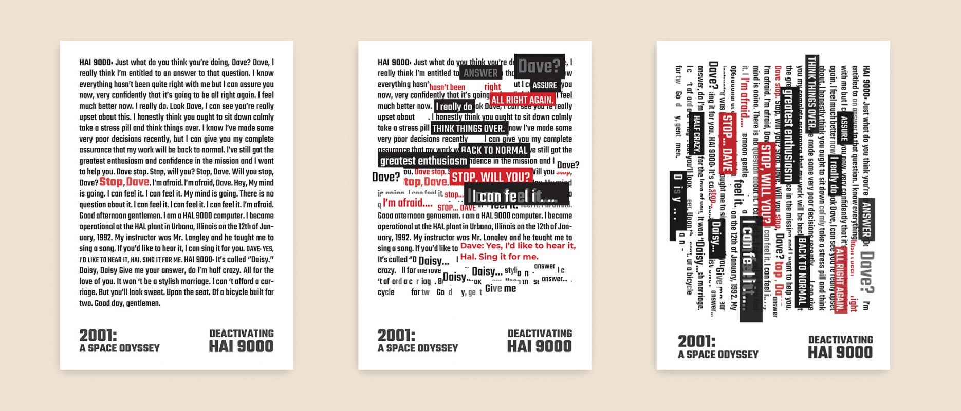
The first poster needs to be able to display the entire script from the short. The 1st version of the poster was simple. Laying out the text and highlighting the words that I think could work. later I found it was too crowded and simplistic, to resolve that, two large titles were added to the poster. The idea was to increase the visibility of the poster at longer distances. However, I soon realised it was not working as well as I intended. it creates an extra weight on the lower part of the poster, misguiding the attention.
The improvement over the next few versions was mostly on shifting the focus from the bottom to the middle, I used a portion of the text and filled it with the red and black background with white type. I have also experimented with different opacity to adjust the power of the type. From the 4th version, the top right side of the poster toned down the words “Dave”, and “answer”. I have also tried different typestyles such as all caps and italics. On the 4th version, I also played with the idea of disappearing by adding the white blocks on the bottom. yet, I discovered the colour was too simplistic, and the overall graphic was still too busy, hard to read and did not match my idea of which all text should be legible.
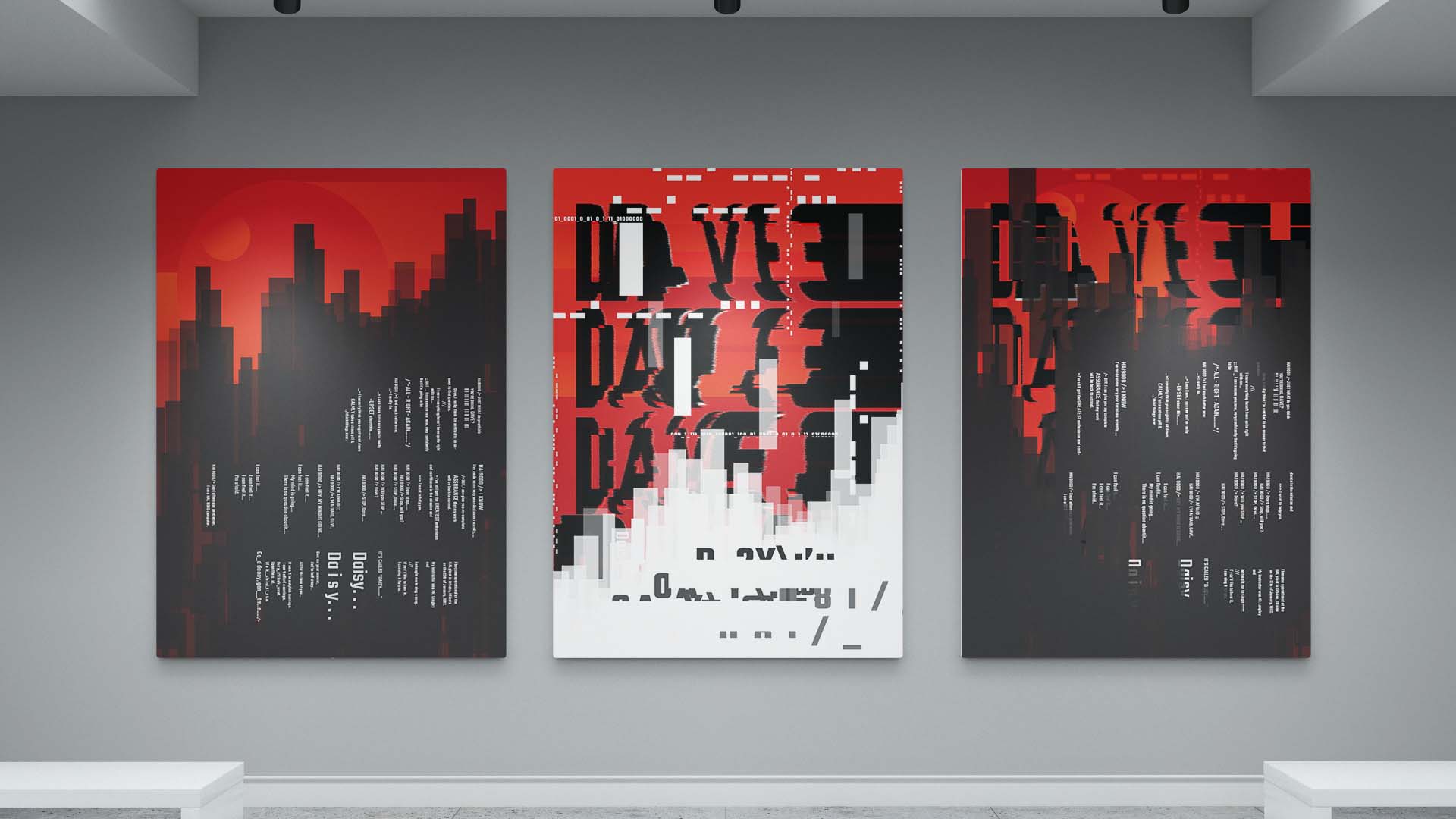
In the final version, I added a red background and dark foreground to bring out the uniformity of the series. Also, I have added some elements such as gradients to the background, ellipses to represent the HAI and horizontal gradient that gives the poster a bit of variation. In this version, I have added more blocks to amplify the feeling and gain more attention to the foreground by contrasting with the white type. I have given sufficient white space for the types to ease the reader. The alignment of the text is trying to create a sense of programming. The highlight of “daisy” is where HAI slowly stopped so, to create space between letters can bring out the context. The vertical orientation of the text is also created to flow with the background cohesively.
1st / 4th / 8th version of the poster
waiting for grammar check
Poster 2
The second poster was more of expressing the fear that HAI has toward Dave and his actions. The poster background was aiming to create the fear. Even though in the film HAI speak in a monotone, but consider the level of intelligence HAI has, it would be crazy not to shout at Dave and try to stop him physically. However, it won not be possible due to his a fixed machine. Therefore, in the poster, I was picturing the feeling and purposely placed it in the background, so that enhanced the sense of helplessness as dave emptying his memories. The distorted “Dave” on the background was trying to display the feeling. The white blocks represent the memory module being take away suggested dave is not going to stop. As more module being taken out, HE became less vocal and slowly wipe out. The red gradients colour at the background can be seen as HAI himself, disappearing, only leaves behind the shattered words “daisy”. The Improvement that made upon the 3rd version was the background colour, the colour as a bit dull. Thus, in the final version, I have added some horizontal gradients to create depth.
3rd 8th
Poster 3
The third poster combined the previous two posters. The 3rd version was again, trying to create the sensation of memory loss. The white background still represents the memory module and taking out by Dave, and the word “daisy” was also suggesting the same idea. The 5th version changes the colour of the memory module, shited from the concept of white to black. And I simplified the background from the image with the script to image with shapes. By doing that, reducing the distraction, making the poster more focus. In the final version, fewer changes are made. The main difference is the background, the morse code and binary code from the second poster. The white colour was too distracting, could potentially lead the audience away from the main text. And also, combining two posters, the elements are fighting for attention, which creates disorder that confuses the viewer. I have Gaussian blurred the morse code to create depth. And adding more blocks to indicate progression.
3rd 5th 8th
Printing
I originally decided to print on matt paper, however, due to the print centre ran out of matt paper, therefore they suggested me to print on semi-gloss paper. I have never used semi-gloss paper before so I took one print as an experiment. The result was outstanding, the paper was not too glossy which could create some nasty reflections, and also brings out the darker colour especially black better than matt paper. Thus I decided the poster series will be printed within the same stock.
本作品是隶属于我在AUT学习期间制作,使用及传播需要遵循许可协议。详细可查帮助中心。
This post is an AUT university project, the use of any kinds must obey the terms.

